ShopDreamUp AI ArtDreamUp

Deviation Actions


Suggested Deviants


Suggested Collections


You Might Like…


Description
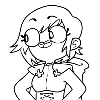
who the heck is this?
i dunno. i tried some stuff. lemme know what you think. i guess?
i just wanted to draw this to relax because i've been more busy lately. Not overly busy at all, but i'm used to having more time to myself i guess : P so i need to figure out how to use that time well, so i feel like it's not wasted. drawing more seems to be a good option.
another option is watching stuff related to Heathers the Musical over and over. it's not very productive, but i like the songs. and the heathers. especially Heather Mac. and Duke. and Chandler. and everyone.
Image size
1552x2700px 1.99 MB
© 2018 - 2024 JumpinJammies
Comments21
Join the community to add your comment. Already a deviant? Log In
This is really wonderful!
Firstly, I gotta say that I like the concept. Since this seems to be a completely original character, the design should really be memorable and truly say something about the character. Since that’s really all there is to go off of, a design really should try to get across a message or feeling. This design gives off the feel of a very fashionable or charismatic organized character. It’s certainly among your best and more memorable designs.
The colors are on point as always in your more detail oriented work. The colors are bright and glossy. They look appropriately pretty and shiny for the character. It really contributes to the design with giving the audience an idea of what she might be like. I particularly like how you use different colors for the actual lines instead of just black. It’s a nice touch.
The technique and use of lines is VERY noticeable. I don’t think I can recall you using something like this in your drawings before. So it’s good that your branching out! It’s very well done here. I particularly like how it’s used on the hair. And it gives her clothing a bit of texture. That dress she’s wearing seems a lot more like a suit than a coat with the way the lines are used.
The background is plain. But that really isn’t a huge issue. The character is the focus here and an elaborate background isn’t necessary.
Now the proportions are where I find issues. It’s not too bad at first, but it definitely garners more attention the more closely I look at it. I say this because I really don’t think you hit the proportions you were intending to get when drawing in this style. Her legs and arms are appropriately proportioned in comparison to one another, but around her shoulders and neck, is where it looks a little shabby. By that I mean, the neck looks like a healthy thinness to it. It doesn’t look super thin on its own, but it definitely comes off more lanky with how the shoulders are drawn in a very “downward” angle. The shoulders look fine with how widely they’re drawn, but again, they look like they’re being placed a lot lower than they should. And it really doesn’t gel well aesthetically for the rest of the body. Just bringing those shoulders up and fixing up the arms accordingly should do the trick.
Overall, this is another new favorite. Great work!